
Real 2016 PSAT Percentiles Reveal Inflation of Last Year's Results

In January of this year, after the College Board had released the first batch of PSAT scores from the redesigned test, we reported on unusually high student percentiles and raised questions about the validity of the top percentile of test takers. When a public school boasted 42 percent of its juniors in the top 1 percent, we dove into the data looking for answers. As we sifted through student reports, we predicted that the College Board was inflating its percentiles, intentionally or unintentionally, due to a number of reasons, ranging from sampling bias to major test differences.
While it is possible that the students who took the test in 2015 were academically superior to the 2014 cohort, the last group to take the now-retired PSAT, we surmised that the inflated percentiles were a result of the College Board not properly taking into account the benefit of eliminating the guess penalty and reducing the number of answer choices from 5 to 4. We also noted that the test itself was fundamentally different from its predecessor, possibly resulting in better performance across-the-board on the better-aligned test.
For whatever reason, the number of students who were informed last year that they performed in the top 1 percent of their class was unrealistically high, causing confusion as parents tried to determine if their child did well enough for National Merit placement and as schools tried to figure out the overall competitiveness of their student population.
When the cutoff scores for the 2015 PSAT were delivered to families this fall, the results were as we had predicted. Across most states, the cutoff score rose despite the fact that the new index maximum was lower – 228 instead of 240. This higher cutoff reflected the College Board’s needed adjustment to ensure that only 16,000 students nationwide would be accepted into the NMS competition as semi-finalists, finalists, and winners. Many students who had been led to believe that they stood a chance – being in the 99th percentile of the “nationally representative sample” – found that they did not qualify.
This year, the College Board made two unexpected changes to its 2016 PSAT scores. First, the College Board moved away from using the research study to determine the percentile range of PSAT test-takers and chose to use real student data, not something the College Board had announced would happen for a few cycles. This had the effect of bringing percentiles into a more expected and reliable range than last year, since the values were based off actual, not estimated, student performance. Second, the College Board chose not to provide the percentile range for the Selection Index score out of 228. On their reports, students will see their score out of 1520, the percentile range of their EBRW, Math, and Composite scores, and their Selection Index score out of 228.*
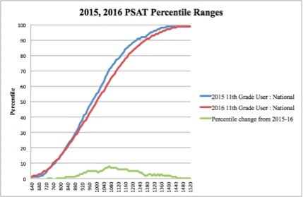
The above chart shows the shift in percentiles from the research-based 2015 PSAT results and the student data from the 2016 PSAT. At either end of the curve, the change is minimal. From a 910 to a 1360 composite score, on the other hand, the percentiles differ by 3 or more points. For example, a student who scored a 980 in 2015 was considered the 51st percentile. In 2016, a 980 is now considered 46th percentile, 6 percentage points lower.
* Note: the 2015 PSAT Percentiles were found using the Understanding Your PSAT/NMSQT 2015 document, which provided national and user percentiles based on research data. The 2016 PSAT Percentiles used the Understanding Your PSAT/NMSQT 2016 document.
Why does this matter?
If you were a sophomore who took the PSAT, scored in the 99th percentile (based off of the research study data), and then scored in a lower percentile when you took the test as a junior, the revised percentiles explain that discrepancy. You likely did not perform significantly worse this time around; rather, in your junior year, you were compared using a different, more rigid, yardstick than was the case in your sophomore. If you scored a 1390 in your sophomore year, you would have been in the 99th percentile of the College Board’s expectation for students who took the PSAT. If you received the same score during your junior year, you are now in the 97th percentile. The difference arises due to the fact that these ranges now use real student data, not the less-accurate research study.
If you are a school administrator who is disappointed if your expected number of National Merit scholars has shrunk considerably, the College Board’s use of percentiles might be a reason. You should not take the new data and conclude that juniors performed significantly worse this time around; they received inflated scores last year and the College Board has taken steps to present the scores more accurately this time around.
Continuing up the chain, if you are a college admissions officer who set a goal of admitting SAT students in the top 75th percentile and thought that the PSAT (and vertically aligned SAT) score of 1100 would result in the top quartile of students, these new PSAT results suggest that tweaking is necessary. According to the student data from the PSAT (currently the only College Board data based off of real student performance), the top quarter of students now sits at 1140.
As for predicting National Merit this time around, the College Board has provided us with a very important piece of missing data: percentiles based on real student data. While they did not include the Selection Index percentile, we can still use the cutoff scores from this past September and your Selection Index to get a sense for how close you are to making next year’s cutoff. It is quite possible that the cutoff score for the 2016 PSAT may differ from the 2015 PSAT by a point or two, but it is unlikely to see the same shift that we saw from the 2014 to 2015 PSATs.
It remains to be seen how colleges and universities will respond to this dramatic shift in reporting. In an extreme example, the College Board reported that a junior who received a 1070 score on her 2015 PSAT would have been within the 71st percentile. This year, a junior receiving an identical score on her 2016 PSAT is now in the 63rd percentile - quite a shift down for the exact same score! Assuming that we see a similar shift in percentiles with the SAT, colleges and universities will have questions as to which percentile - 63rd or 71st - these two student belong. The change in PSAT percentiles raises the question of the validity of the research-based SAT percentiles as well as that of the SAT/ACT concordance table*, which was constructed using the College Board’s research study.
*UPDATE 6/14/2018: ACT, Inc and the College Board have released updated concordance numbers. The newest numbers tell students who score above a 1250 on the SAT that their equivalent ACT score is about 1 point higher than was communicated in 2016's tables.
We knew that this year would be one of moderate turmoil as the College Board overhauled its flagship program and sought to bring it up to speed with the ACT. We knew that, at some point, the College Board needed to rip off the bandaid and reveal the underlying problems with its research-based percentiles. The College Board had stated that it would be several years before it transitioned to student data, but it seems that the higher-ups decided to face the music sooner rather than later. If the PSAT went through such a bumpy shift as it transitioned from research-based data to real student data, we should expect no less of the SAT. Students, high schools, and colleges would do well to prepare accordingly.
*The College Board has shown some inconsistency with its definition of how its user percentiles are determined. The website still says that the percentiles compare students to a research study, while the Understanding your PSAT/NMSQT 2016 document states that the user group percentiles compare students with “actual performance of test takers” who took the test in 2015-16. A call to a College Board representative confirmed that the percentiles for the user group related a student’s score to the actual performance of the students who took the test in 2016.
Questions? Need some advice? We're here to help.
.webp)

Take advantage of our practice tests and strategy sessions. They're highly valuable and completely free.